Japandi Style: A Calm, Grounded Way to Design Your Home
In a world filled with overstimulation, clutter, and constant noise, your home should be more than just a space—it should […]
In a world filled with overstimulation, clutter, and constant noise, your home should be more than just a space—it should […]
Life can feel loud — not just in sound, but in energy, tasks, screens, and obligations. That’s why creating a
Sometimes, at the end of a long day, all we want is to feel grounded.When my mind feels rushed and
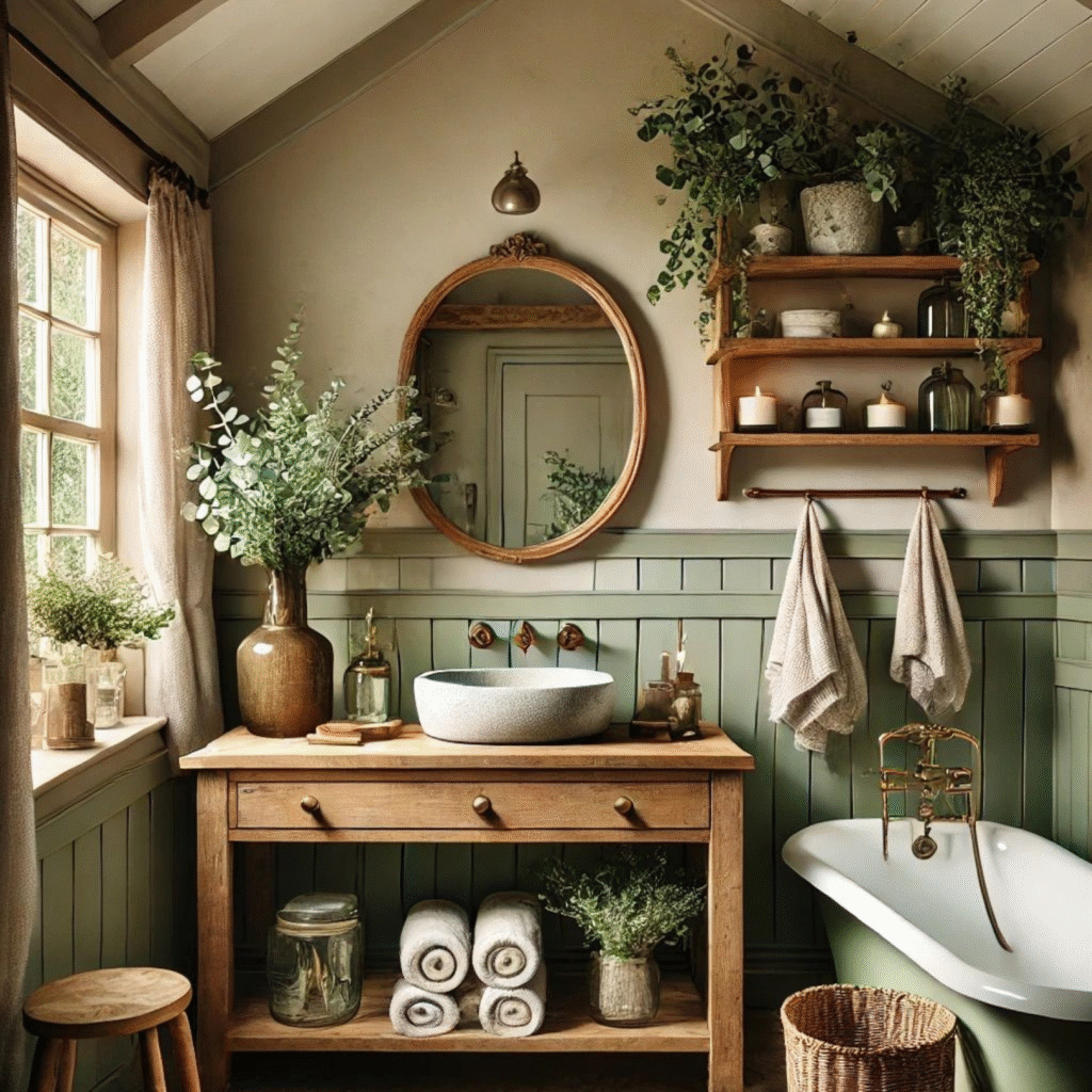
Sometimes bathrooms are just… rooms. But what if yours could be a retreat? A space where calm takes over and
Some days, the outside world feels too loud.Your thoughts scatter, your body resists, and even your home doesn’t feel entirely
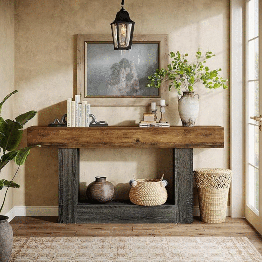
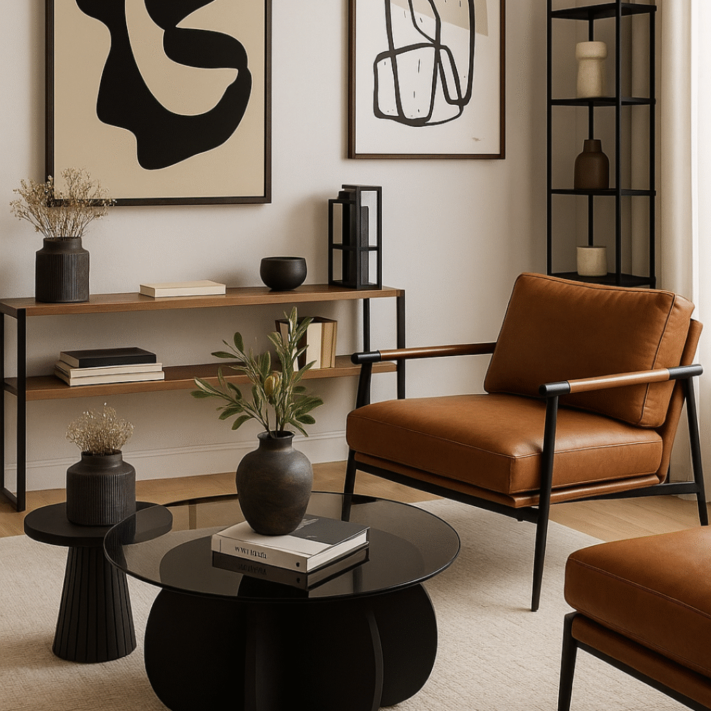
Have you ever walked into your home, dropped your keys, and still felt like something was missing?A sense of weight, comfort, or maybe… groundedness? We often focus so much on aesthetics or trends that we forget how a space feels.This quiet console corner, filled with rich wood textures and muted earthen tones, isn’t just visually soothing — it evokes something deeper: belonging. 🤎 The Psychology of Rich, Natural Browns The palette you see here isn’t just beautiful. It speaks the language of emotional safety.From the charcoal-grey console legs to the burnt pine tabletop, the colors create a sanctuary-like atmosphere — without screaming for attention. In color psychology, brown represents structure, reliability, and warmth. It carries the energy of earth — supportive, grounding, and comforting.Unlike bolder tones, brown chooses the background. It allows your thoughts to quiet down, and your body to release tension.It holds you. Softly, steadily. This color combination — rich wood + soft straw + antique grey — brings a level of emotional intimacy that doesn’t come from design alone. It comes from intention. 🌾 Comfort, Calm, and Quiet Sophistication This space is about more than decor. It’s about what you need when you return home: ✨ Want to recreate this feeling? This moodboard was built to support calm, structure, and belonging — with pieces that are budget-conscious yet timeless in feel.Take what resonates. Leave what doesn’t.But always decorate for your nervous system, not for the algorithm. Why This Mood Works This post may contain affiliate links. If you purchase through them, I may earn a small commission — at no extra cost to you. Thank you for supporting Calmessence.
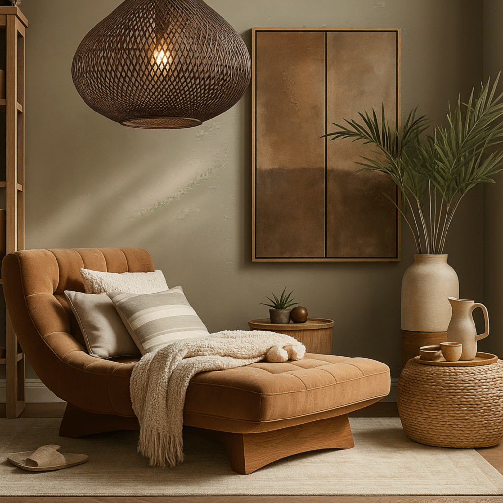
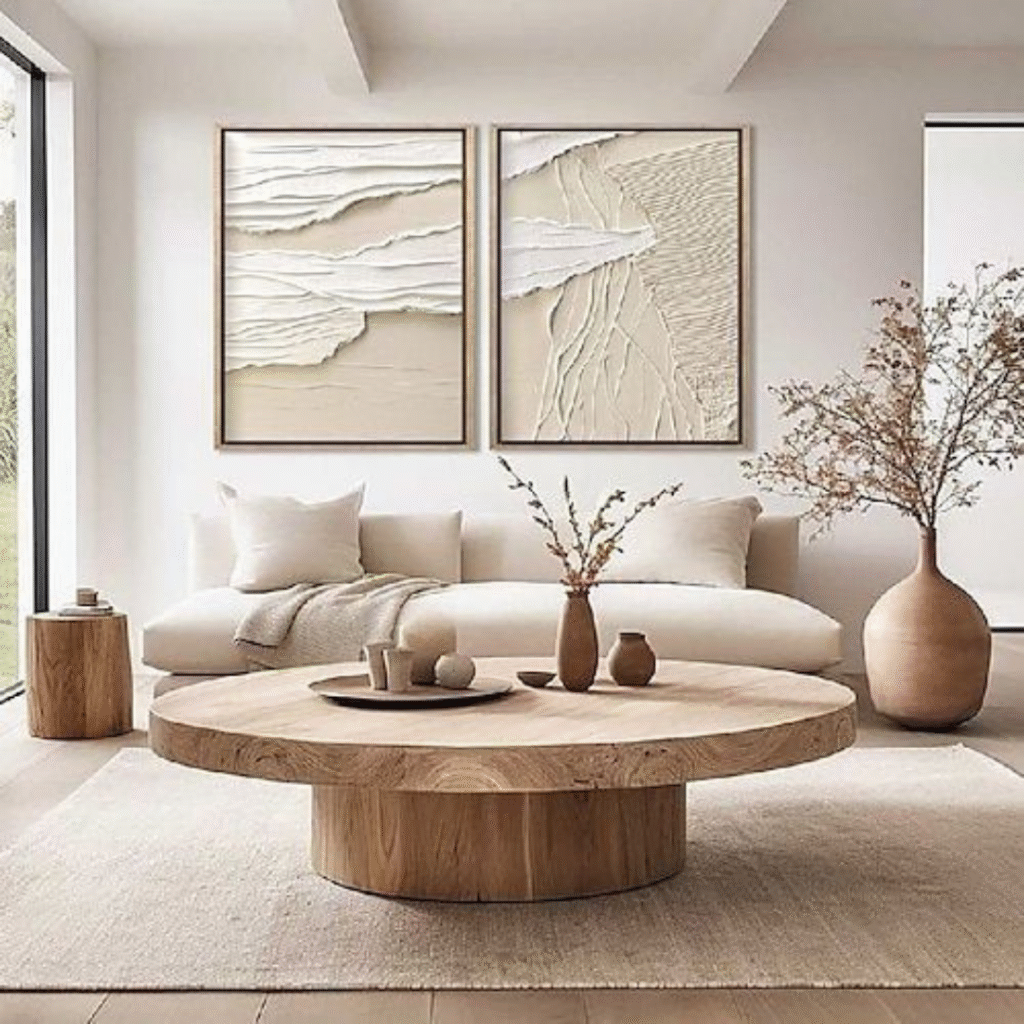
Feeling Ungrounded in Your Own Home? Is your mind noisy, your space chaotic, and your energy scattered?Sometimes our internal mess reflects in our surroundings — and sometimes, our home’s energy unsettles us from within.If you’ve been feeling ungrounded and restless at home, maybe the answer is right in front of you — in your own living room. If you’re craving a minimalist, budget-friendly, and calming transformation, coffee tones and soft creamy hues can help bring you back to center.It’s possible to create a space that feels not only beautiful, but emotionally supportive. Coffee + White: A Modern Meditation Coffee tones — soft latte, warm camel, neutral beige, and natural woods — help us reconnect with nature.When paired with white, they create a visual pause — a breath for the eyes. ✔ White: clarity, openness, and mental freshness✔ Brown: stability, grounding, and emotional weight Together, they create a sanctuary.A space that gently lets go of excess, embraces simplicity, and allows you to truly feel at home. The Quiet Strength of Coffee Tones Coffee hues don’t shout. They don’t demand your attention — they just hold space.They quietly slow down the energy, pull scattered thoughts back together, and wrap your home in a sense of calm.Like the warmth of a cup of coffee in your hands, these tones hug the room. Earthy tones have been shown to relax brainwaves, calm the nervous system, and help us return to the present moment.If you’re seeking a grounded, emotionally balanced atmosphere, surrounding yourself with textures in warm coffee hues is a powerful start. These tones also build emotional safety.In color psychology, brown is associated with roots, return, and comfort.So it’s not just an aesthetic choice — it’s a psychological one too. When you’re ready, here are the pieces to help you bring this feeling home…
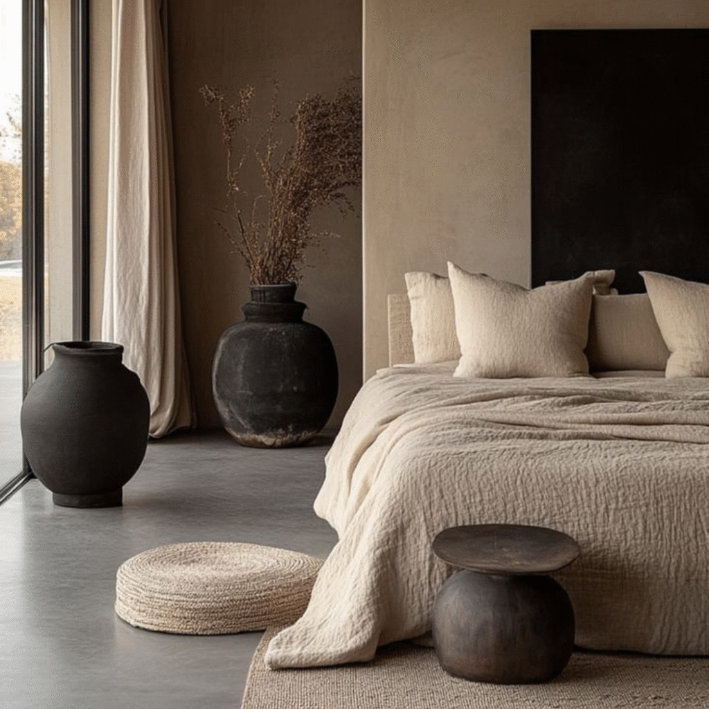
We all deserve a bedroom that feels like a retreat — a space where stress melts away and peace takes
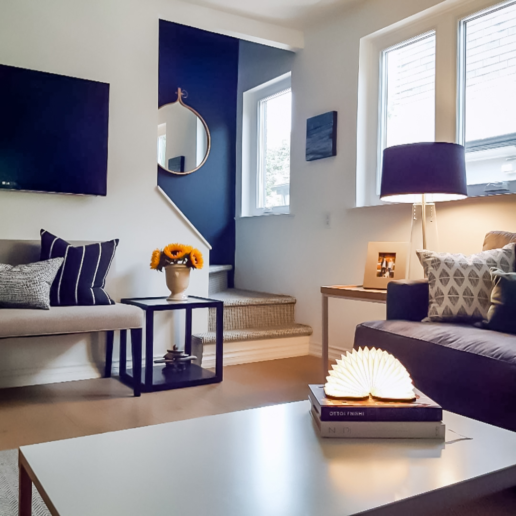
Blue is a color that speaks directly to the nervous system. It represents loyalty, trust, and emotional stability.From the open
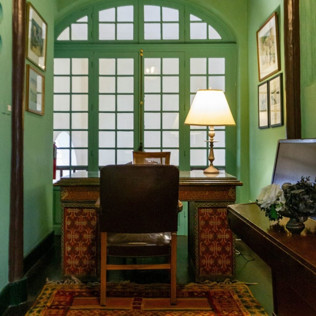
Green is the color of nature, renewal, and inner balance. It symbolizes growth, emotional healing, and the gentle return to