
Amazon Best Choices: The Ultimate Gift Guide for Christmas (With Personal Favorites!)
Gift shopping doesn’t have to be overwhelming—especially when the options are beautifully curated. Whether you’re shopping for a cozy night […]
Gift shopping doesn’t have to be overwhelming—especially when the options are beautifully curated. Whether you’re shopping for a cozy night […]

Autumn is one of the most special seasons—a time when nature slows down, colors soften, and our inner world becomes

In a world filled with overstimulation, clutter, and constant noise, your home should be more than just a space—it should
Do you also carry the quiet but exhausting weight of anxiety at the end of the day?Your body may feel
Eating healthy doesn’t have to be complicated. Cook with less oil, drink plenty of water, and make space for simple
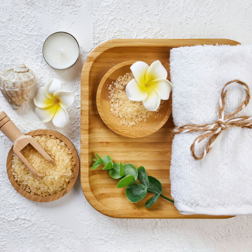
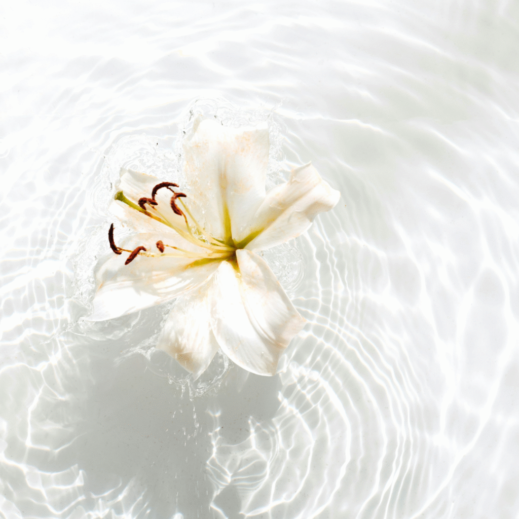
We all deserve the kind of calm that melts our stress away the moment we step into our bathroom. And

Life can feel loud — not just in sound, but in energy, tasks, screens, and obligations. That’s why creating a
Some mornings feel heavy — your body won’t move, your mind resists clarity, and even the smallest task feels overwhelming.

Understood by Ancient Wisdom, Embraced in Daily Rituals Some mornings you wake up and everything feels too much.A foggy mind.

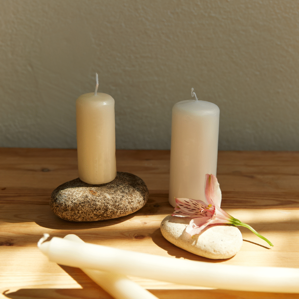
Sometimes, at the end of a long day, all we want is to feel grounded.When my mind feels rushed and